Influencer Marketing Dashboard: Metrics, Examples, and Tools
An influencer marketing dashboard gives you a live view of creator and campaign performance across your social channels. Track reach, engagement, costs, ROI, and audience quality in one place, compare platforms and creators, and spot what needs attention before your next report.

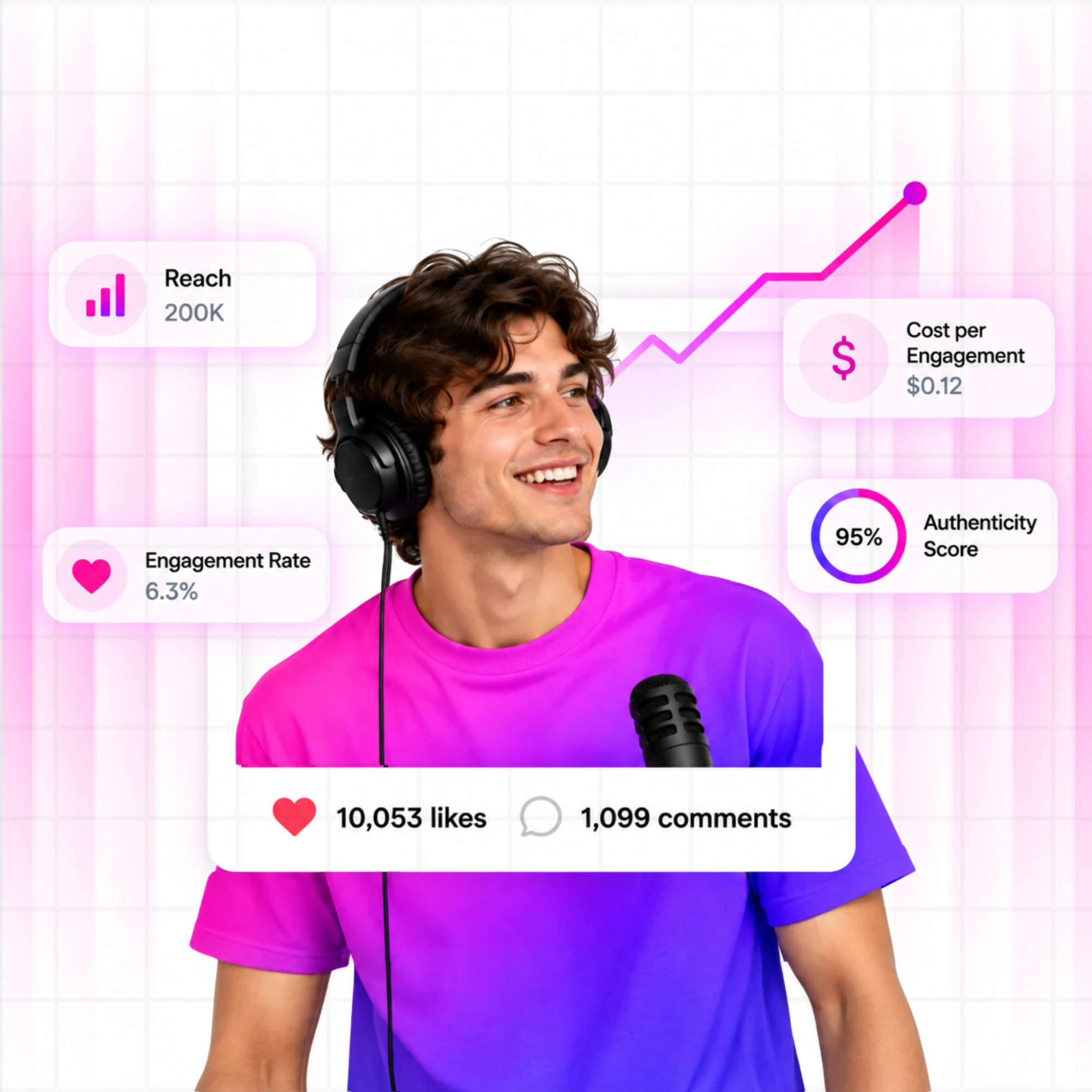
Your campaign hit 200K impressions across four platforms. The engagement screenshots looked great. But when your CMO walked in and asked what it actually returned, you had nothing ready. Just a tab with Instagram Insights, another with TikTok analytics, a LinkedIn page you don't know how to export, and a half-finished Google Slides deck that took two hours to build last month.
There's a bigger problem here. By the time that deck was in the room, the data was already five days old. The campaign had moved on, but the conversation hadn't. It's a visibility problem, and it's exactly what an influencer marketing dashboard is built to solve.
This article covers what a dashboard actually is, why it's different from a report, which metrics to track, what a good one looks like in practice, and which tools fit which team.
TL;DR: Influencer Marketing Dashboard
- An influencer marketing dashboard is a live, continuously updated view of creator and campaign performance across your connected social platforms. It gives you one place to see what's working instead of logging into five accounts every Monday morning.
- Group your metrics into five buckets (reach, engagement, cost, ROI, and audience quality) rather than tracking everything at once. Most teams only need 8 to 12 numbers they'll genuinely act on.
- A dashboard is the live view you check weekly. A report is the finished document you build from that data when your CMO wants answers or a client needs a monthly summary.
- Spreadsheets stop working the moment you're tracking more than 10 creators across three or more channels, or when stakeholders start asking ROI questions faster than you can export data.
- Follower count alone won't tell you which creator is safe to sign. Audience quality scoring, not raw reach, is what separates a dashboard you can trust from one you're just staring at.
- Test Favikon free for 7 days, no credit card needed.
What Is an Influencer Marketing Dashboard?
An influencer marketing dashboard is a live view of creator and campaign performance across all your connected social channels, built to show what's happening now. Think of it as an influencer marketing analytics dashboard rather than a static export. It refreshes on a set cycle as your campaigns run (Favikon updates post performance every 22 hours), which is what separates it from a one-time pull or a monthly report. That's not second-by-second, but it's a different category from a spreadsheet you touch once a week.
Most dashboards fail in one of two directions. Some show engagement volume with no cost attached, so you're celebrating creators who are actually your least efficient spend. Others show spend totals with no performance context, so you can't tell which creator actually earned their fee. A useful dashboard connects both, showing campaign activity next to the spend behind it, so you can see what each creator delivered and whether the return was there.
Marketing managers use it to track ROI without having to separate accounts every week. Agency leads use it to compare performance across multiple client accounts at once. If you're running creators across Instagram, TikTok, YouTube, and LinkedIn simultaneously, a dashboard is the best way to keep an accurate picture. It won't explain why a creator underperformed, but it'll show you quickly that they did.
Dashboard vs Report
People use these words interchangeably, and that's where the confusion starts. An influencer reporting dashboard is the live operating view you check on an ongoing basis. A report is a finished document built from that data for a specific audience at a fixed point in time. One updates as your campaigns run. The other captures what already happened.
The practical difference shows up every month. Most teams rebuild the same data from scratch for every client review because there's no structured dashboard feeding them clean numbers. When the data is already organized, building the report becomes a formatting exercise. When it isn't, it becomes a two-day research project nobody budgeted for.
A dashboard that can't get its numbers out cleanly just becomes a second manual export step. Look for CSV export on raw post data and a polished, exportable summary you can hand to a client or a CMO without reformatting it first. That's the difference between a dashboard that feeds your reporting and one that just adds another tab to check.
Here's how the two actually differ:
Signs You Have Outgrown a Spreadsheet
If pulling weekly numbers takes more than 30 minutes, the spreadsheet is already working against you.
Here's what it looks like when that happens:
- You're managing more than 10 creators and updating the sheet manually after every post. One missed update throws off your engagement averages, and by Friday, the numbers you're reporting are no longer accurate.
- Your campaign total shows 5,000 conversions, but one creator is driving 80% of them. A spreadsheet rolls everything into the same average, and you end up renewing the wrong partners without ever knowing it.
- You've got creators across three platforms, but your total reach figure is a single number with no breakdown. You're reporting confidently on a campaign you can't actually see.
- Platform analytics don't update in real time. By the time Instagram Insights refreshes and you copy the numbers, the data is already a day or two old, and the platform has already moved on.
- Building the weekly report takes longer than actually reading what's in it. That time should go to optimizing the campaign.
- A stakeholder asks a straightforward question' What's the cost per engagement?' and it takes you 20 minutes to find the answer. That's a structural problem.
The Metrics an Influencer Marketing Dashboard Should Show
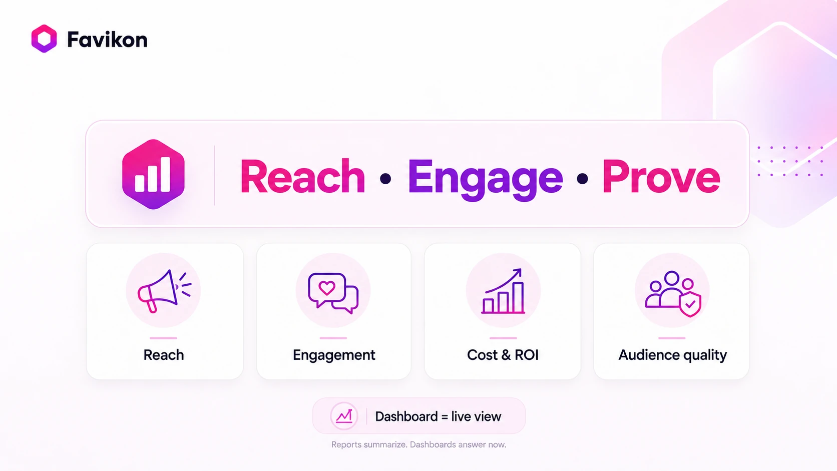
Not every metric belongs on your dashboard. A well-built influencer marketing KPI dashboard tracks the 8 to 12 numbers your team will actually act on, organized into five groups: reach, engagement, cost, ROI, and audience quality.
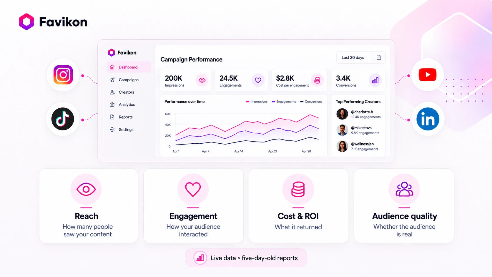
Here is what each one actually tells you and why it earns its place.
Reach and Visibility Metrics
Reach tells you how many unique people saw your content. Impressions tell you how many times it appeared on a screen. One person can generate multiple impressions, so impressions will always equal or exceed reach. Start with reach and treat impressions as the supporting number.
The reach figure shown in your spreadsheet is almost certainly inflated. Three creators in the same niche, each with 100K followers, do not deliver 300K unique viewers. Their audiences overlap. The real number of unique people seeing your campaign is often closer to half the combined total. Most platforms don't flag this automatically.
Platform definitions also differ in ways that quietly distort your numbers. Instagram "reach" counts unique accounts. TikTok "views" count total plays, including replays. YouTube "impressions" measure how many times a thumbnail appeared on someone's screen. Pulling all three into one column and labeling it total reach produces a number that means nothing.
Three rules worth keeping in your tracking setup:
- Flag potential audience overlap whenever two creators share the same niche and similar follower range.
- Track reach per creator and per platform before combining them into a campaign total.
- Use reach as a context metric. High reach with low engagement is a warning sign.
Engagement Metrics
Engagement rate measures the percentage of your audience that interacted with a post. The formula is simple: total interactions divided by reach, multiplied by 100. The interpretation is where most teams go wrong.
A save on Instagram means the viewer wanted to come back to the content, which is the closest thing to purchase intent without clicking a link. A share means the viewer thought the content was worth attaching their own name to. If your dashboard only shows total engagement, it's hiding the signals that actually predict what comes next.
There is one more pattern worth watching. If a creator's engagement rate drops sharply on sponsored posts compared to their organic content, that gap is telling you something real. The audience likes the creator but doesn't trust the fit. That is fixable, but only if your dashboard shows the split.
Three signals to build your tracking around:
- Compare engagement rates across creators in the same niche. A 3% rate on a micro-creator and 0.8% on a macro-creator tell you where your budget actually resonates.
- Watch for suspiciously high engagement on sponsored posts. It can indicate coordinated fake interactions, which audience quality metrics will confirm or rule out.
- Track saves and shares separately from likes and comments. They are signals of intent.
Cost and ROI Metrics
This is the section most dashboards skip, and it's the only one stakeholders actually care about. Cost per engagement is calculated by dividing total campaign spend by total interactions. Cost per acquisition is calculated by dividing total spend by conversions. Return on ad spend divides revenue generated by total spend. All three are straightforward to calculate once you have clean inputs.
The inputs are where teams get burned. Platform-reported numbers give credit for a conversion the moment someone saw your content, even if they converted three weeks later through something completely unrelated. That inflated number is easy to report and hard to defend when someone asks how you calculated it.
This matters for one practical reason. If you're calculating cost per acquisition from platform-reported numbers alone, you're optimizing against a figure that won't survive a real budget conversation. Cost per engagement, calculated from your actual spend and a clean click count, is the number you can stand behind without caveats.
Three practices that keep your cost metrics honest:
Calculate cost per engagement from total costs, including fees, product seeding, and amplification spend. Creator fees alone understate what the campaign actually costs.
Give every creator a unique tracked link so clicks can be traced back to a specific person and post, not just a campaign total.
If you need revenue-level attribution beyond clicks, run that through your own analytics stack rather than trusting a platform-reported conversion number as is.
Audience Quality Metrics
A creator with 200K followers and 40% fake accounts does not have 200K followers. They have 120K. Every metric built on that follower base is wrong. Reach is overstated, engagement rate is artificially inflated, and your CPA is calculated against an audience that was never real. Fake followers do not buy.
Audience quality scoring assesses the percentage of a creator's following that consists of real, active accounts versus bots, purchased followers, or dormant profiles. Favikon surfaces two distinct scores for this. The Authority Score measures a creator's genuine influence within their niche. The Authenticity Score flags fake engagement and follower manipulation. These are separate systems measuring different things.
Bot engagement is particularly hard to catch in a spreadsheet because it looks identical to real engagement in the totals. The tell is in the pattern. Engagement spikes within minutes of posting, generic or repeated comments across posts, and like-to-comment ratios that are wildly disproportionate. A dashboard linked to audience verification data flags these before you sign the contract.
Two checks before any contract goes out:
- Check audience quality before signing a creator.
- Treat a creator's authenticity score as a multiplier on every other metric. High reach with low authenticity means every number on your dashboard is inflated.
What a Good Dashboard Looks Like in Practice
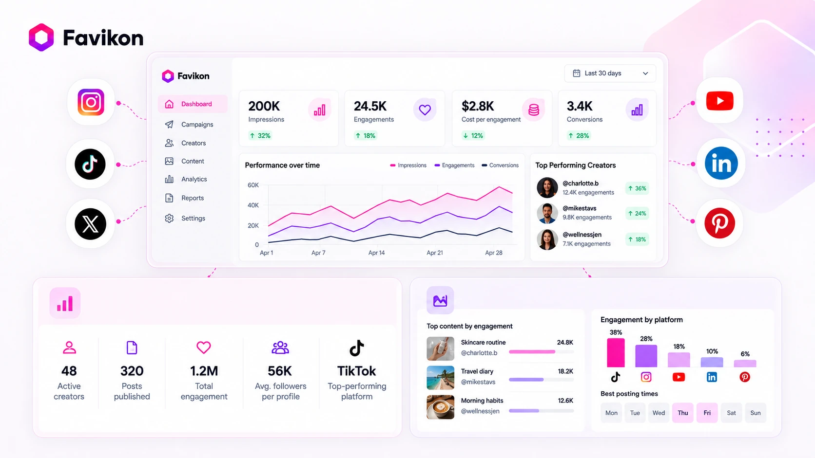
A good dashboard is the one where you open it Monday morning and already know what needs your attention before you've had your coffee.
Most dashboards are built to impress in a demo. Sometimes the fastest answer doesn't even need the dashboard open. Favikon's Chrome extension surfaces a creator's engagement rate right on their social profile, so a quick gut check doesn't require switching tabs at all.
Favikon's dashboard is organized around two views that most teams need regardless of which platform they use. Understanding the logic behind each one is more useful than a feature-by-feature walkthrough.
The Top-Line Summary View
The first thing a dashboard should show you is the health of the whole program at a glance. That means the total number of creators active in the current period, the total number of posts published, the total engagement across all channels, and the average follower count per profile. That last number matters more than most people realize.
A campaign average of 15K followers per creator tells a very different story than 150K, even if the total engagement looks similar. Follower range shapes what kind of content works, what the audience expects, and how you interpret every other number on the screen.
Favikon's summary layer pulls this across every social channel simultaneously. You're not toggling between an Instagram tab and a TikTok tab and manually adding the numbers together. The program-level view is already done.
The Content Performance View
The summary indicates whether the program is healthy. The content view tells you what to do about it.
This layer shows which specific posts are driving the most engagement, which posting windows are outperforming, and how performance is distributed across platforms. The platform distribution piece is the one most teams underuse. If 70% of your engagement comes from one channel but your budget is split evenly across three channels, that's an optimization decision right in front of you.
Top post tracking also catches something spreadsheets miss entirely. The highest-performing content is rarely from the creator with the biggest following. It's usually a mid-tier creator who hits a topic at exactly the right moment for their audience. You'll only see that if your dashboard surfaces individual post performance rather than just creator-level totals.
Posting time data is worth treating with some skepticism. Platform algorithms have made optimal posting windows less predictable than they used to be. Use it as one signal among several.
The Role-Based Difference
A marketing manager and an agency lead are looking at the same dashboard for completely different reasons.
The marketing manager wants to know if this specific campaign is on track to hit its targets. They check the same five numbers every week. Total engagement, cost per engagement, top creator, platform split, and whether click tracking is picking up activity across every campaign correctly. Everything else is noise until something breaks.
The agency lead is running multiple client programs at once. They need the same summary view but filtered by client, with performance benchmarked against the previous campaign period rather than against an absolute target. The question is, " Did this campaign work better than the last one for this client?"
Favikon's campaign management layer handles both use cases from the same interface. A marketing manager sets up one campaign and monitors it. An agency lead sets up multiple and compares them. The underlying data structure is the same. The filter is different.
That's what a good dashboard actually does. It doesn't give everyone everything. It gives each person the right slice of the data without making them dig for it.
What a Dashboard Cannot Tell You
A dashboard shows you what happened. It won't tell you why a specific creator underperformed, whether the content brief was wrong, the audience timing was off, or the product just didn't resonate with that community. It also doesn't replace vetting a creator's audience before you sign them. Bad audience quality doesn't show up after the campaign. It was always there.
Build It Yourself or Buy a Platform?
A spreadsheet works fine for five creators on one or two platforms. Free BI tools like Looker Studio can pull a few data sources together, but you're still doing the data cleaning and connection work manually.
The threshold at which a dedicated platform starts earning its cost is usually around 10 or more creators across three or more channels, or the moment stakeholders start asking for ROI answers weekly instead of monthly. At that point, it costs accuracy because the data is always slightly behind, and someone is always reconciling discrepancies instead of making a decision.
How We Chose These Platforms
Five criteria drove every inclusion decision here, and they're worth stating openly so you can weigh them against your own priorities.
Workflow speed came first. A platform that still makes you build a shortlist by hand, or copy engagement numbers into a spreadsheet, is asking you to do the job the software should be doing. AI-assisted sourcing and reporting made the difference here.
Creator intelligence came second. Follower counts tell you almost nothing about whether an audience is real or whether a creator's content will land with your buyer. A platform that scores authenticity and audience quality on every profile gives you something to act on before you sign a contract, not after a campaign underperforms.
Pricing transparency came third. Platforms that require a demo call before revealing a price range make it harder to qualify fit before you've spent an hour with a sales rep. Where pricing is published, we used the live figures. Where it isn't, we've labeled estimates clearly.
Audience quality scoring came fourth. Follower counts mean nothing if the audience isn't real. Every platform on this list either surfaces fake-follower detection natively or we've noted that it doesn't.
Buyer type fit came last. No single tool is the right answer for every team. Each platform below maps to a specific scenario. Find yours and start there.
Compare the Five at a Glance
Tools Worth Considering for an Influencer Marketing Dashboard
A good social media influencer analytics dashboard covers the channels your buyers actually use. The right tool depends on what you're actually trying to do. Each platform below is best suited to a specific buyer type. Find your scenario and start there.
1. Favikon
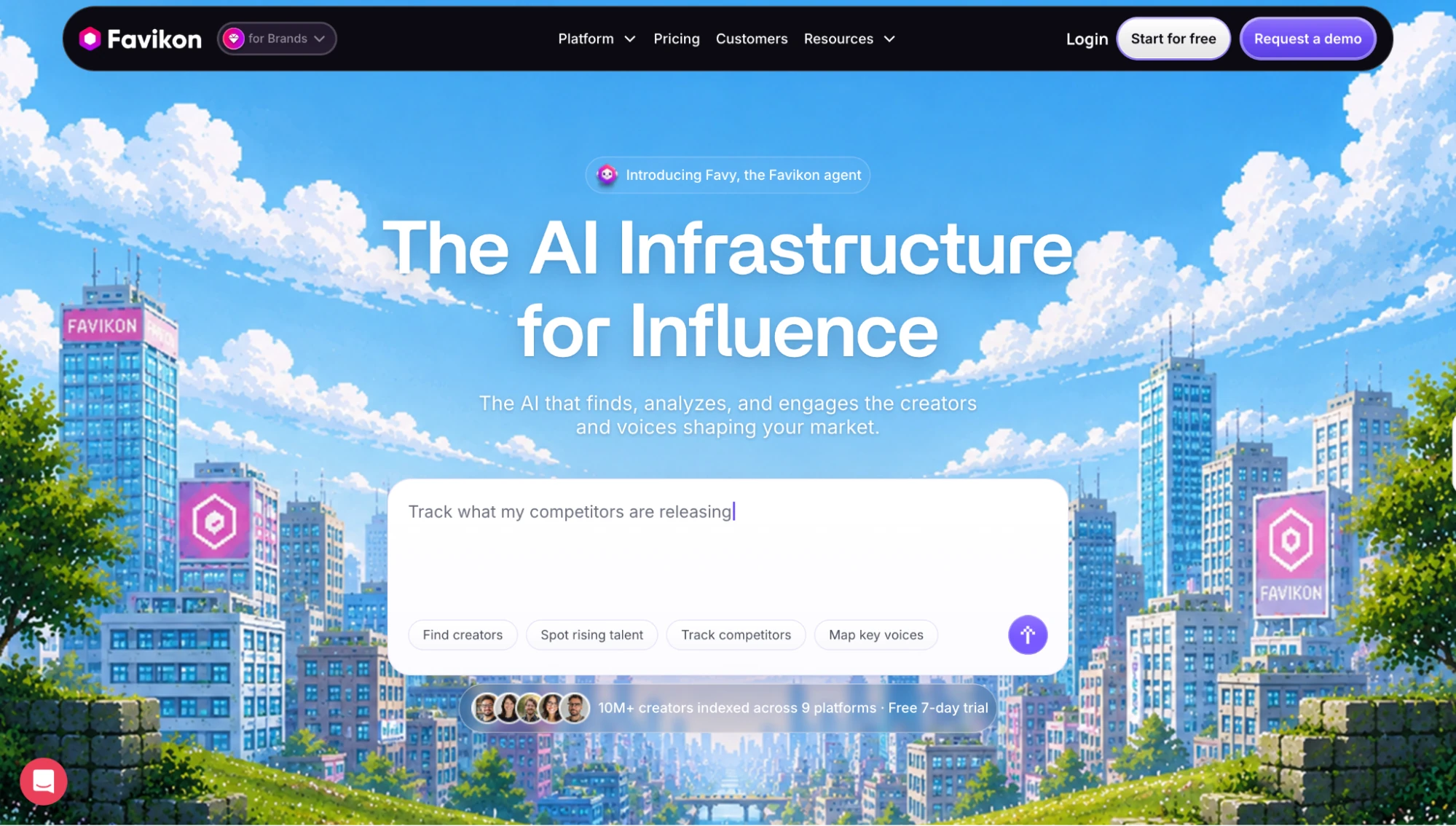
What is it? Favikon is an AI-powered influencer marketing and creator analytics platform that indexes 10M+ creator profiles across nine social channels in a single dashboard view.
Best for: Marketing Manager, Agency Lead, or social team across any vertical that wants multi-channel creator visibility without hiring someone to run it manually.
Why I Picked It: Favikon's AI Agent is the lead reason it's on this list. It handles sourcing, shortlisting, and reporting in the background, so your team spends time deciding instead of copying numbers between tabs. The other reason is the depth on each creator profile. Authenticity and Authority scores sit on every result by default, so you're vetting fit and fraud risk before you reach out, not after a campaign already underperformed.
Features
- A single dashboard pulls every indexed channel into one view, so you're not toggling between platform tabs to compare creators across networks in the same report.
- Click tracking gives every creator a unique link so that you can see the location, device type, and human versus bot split behind each click on their posts, a clean read on post performance without a separate analytics tool open.
- An AI Agent, Favy, handles repetitive groundwork like sourcing shortlists and drafting outreach, and plugs directly into ChatGPT or Claude if that's already where your team works.
- 600+ AI niche categories mean you can filter to exactly the creator type your campaign needs (fintech micro-influencers, B2B SaaS reviewers under 50K followers) rather than sorting through broad categories that return the wrong pool.
- Authority Score and Authenticity Score on every creator profile, giving you two separate signals. How influential a creator actually is within their niche, and whether their audience consists of real, active accounts.
- Creator CRM and outreach handled from a single inbox, keeping shortlists, conversations, and campaign status together rather than spread across email threads and spreadsheet tabs.
Limitations
- Favikon is not built for high-volume DTC product seeding or inventory-connected affiliate workflows. Teams running those as their primary use case will want a dedicated e-commerce platform alongside it.
- Favikon doesn't handle creator payments in-platform yet. Teams paying creators directly will need a separate payment workflow alongside it.
- Favikon's CRM integrations are built for marketing workflow management. Enterprise teams with complex CRM automation requirements will want to check integration depth during the trial.
Pricing
Favikon runs on usage-based credits with no annual lock-in. Core starts at $199/month with 500 credits included. Pro is $299 per month with 1,000 credits. Enterprise is custom-quoted for larger volume. A 7-day free trial is available with no credit card required.
2. GRIN
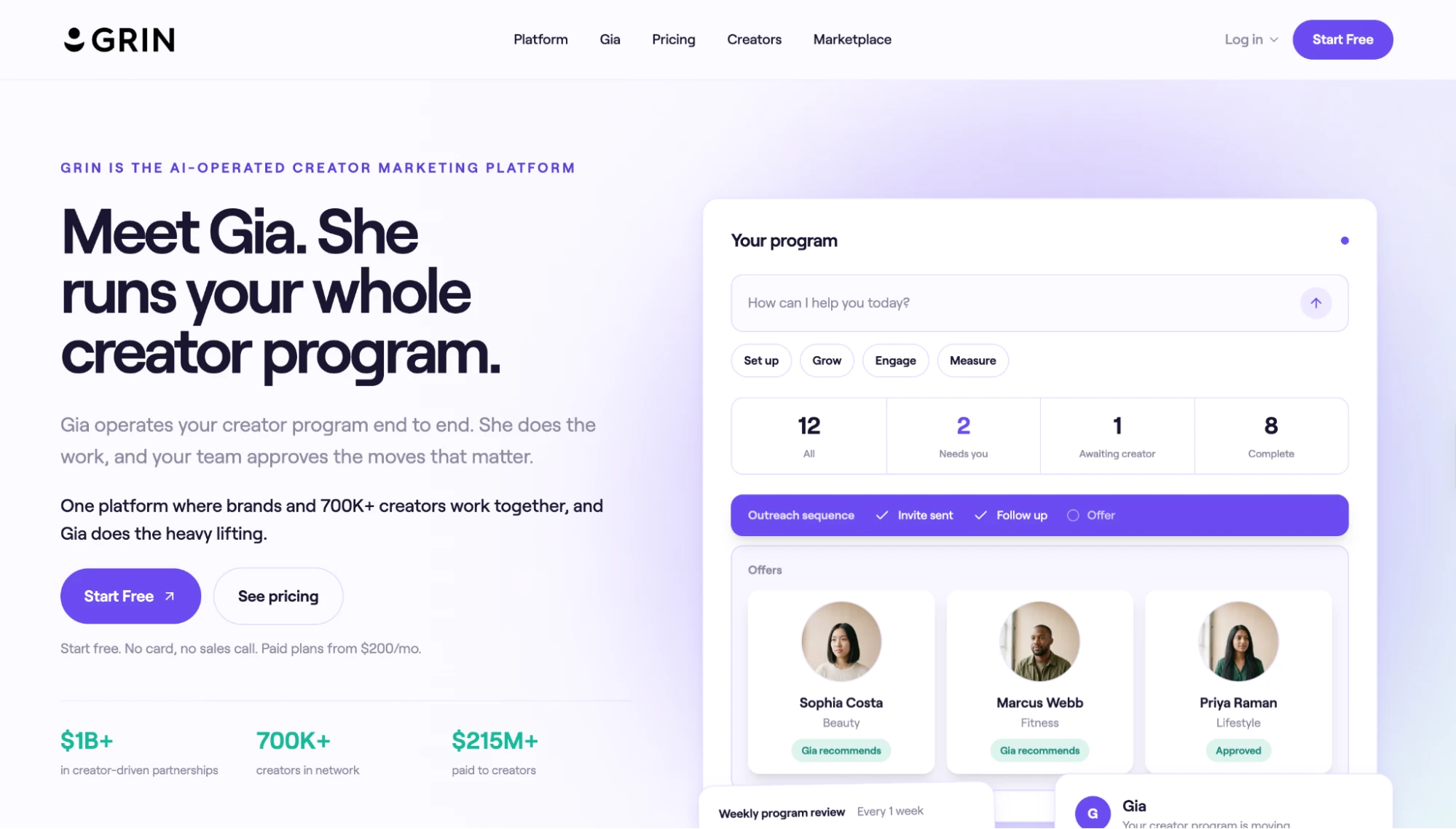
What is it? GRIN is a creator management platform built around the DTC ecommerce lifecycle, covering product gifting, affiliate tracking, creator payments, and campaign analytics in one connected workflow.
Best for: DTC or e-commerce marketers running always-on creator and affiliate programs.
Why I Picked It: GRIN's tight Shopify integration is what sets it apart from more general-purpose platforms. Sales attribution runs natively within the same system that manages creator relationships, eliminating the manual export-and-reconcile step that typically consumes reporting time for DTC programs. It makes more sense for brands running ongoing gifting and affiliate programs than for teams running one-off campaign bursts.
Features
- Month-to-month with no card required and no minimum commitment, so you can test the platform against a specific campaign window without committing to an annual contract before you've seen results.
- Full DTC creator lifecycle management covers product gifting, affiliate link generation, and campaign performance tracking inside one platform, so you're not stitching together a separate affiliate tool with a separate creator CRM.
- A direct Shopify integration lets inventory data and creator campaign data connect natively, with a tracking SDK available for other e-commerce stacks, without a third-party attribution layer sitting in between.
- In-platform creator payments so you're not managing bank transfers separately from the campaign itself, which matters at scale when you're paying dozens of creators each month.
Limitations
- Support is primarily self-serve on lower tiers. There's no assigned account management built into the base plans, so onboarding and troubleshooting fall to your own team from day one.
- The creator pool is built around transaction-verified creators who've already completed partnerships inside GRIN, so teams that need to discover and vet creators outside that existing pool will hit a ceiling quickly.
- No meaningful B2B creator coverage. If your buyers follow LinkedIn creators, read newsletters, or listen to industry podcasts, GRIN wasn't built for that audience, and it shows in the discovery layer.
Pricing
GRIN runs a credit-based model. Plans start at Free ($0/month, 200 credits, no card required), Starter ($200/month), Growth ($500/month), Scale ($1,000/month), and Complete ($1,500/month).
3. CreatorIQ
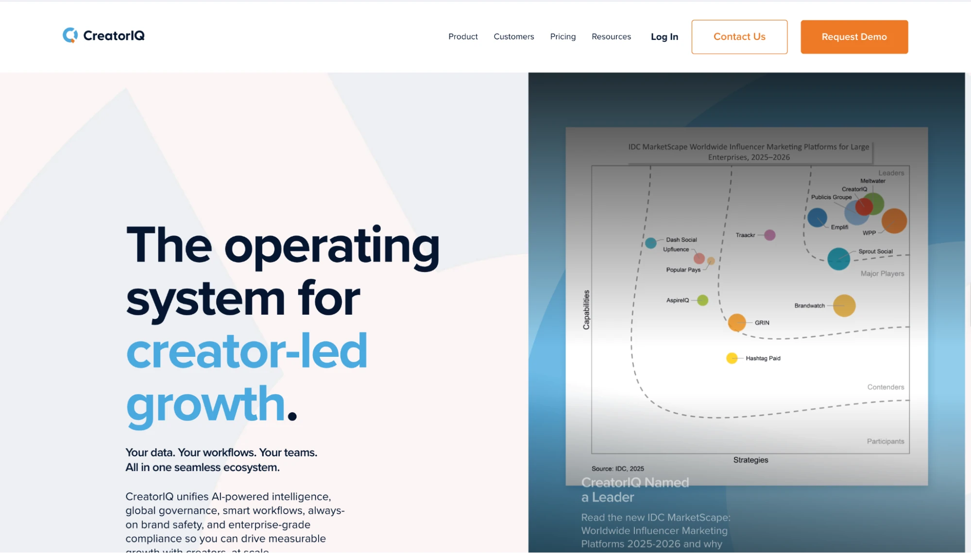
What is it? CreatorIQ is an enterprise creator intelligence platform built for global, multi-market brand programs that need formal compliance workflows, CRM and ERP integrations, and multi-layer content governance.
Best for: Enterprise buyers running large-scale global programs with formal procurement and compliance requirements.
Why I Picked It: CreatorIQ is what enterprise teams buy when influencer marketing has become a documented business function rather than an experimental channel. The dashboard is built around program-level benchmarking rather than campaign-level snapshots. For a team managing 200 creators across twelve markets, that matters more than a clean single-campaign view. Clients include Google, Delta Air Lines, and Sephora, which clearly signals the buyer profile.
Features
- Multi-market program management with CRM and ERP integrations built for formal enterprise workflows, covering programs running coordinated campaigns across multiple regional markets simultaneously.
- Multi-layer content approval processes with audit trails that procurement teams and legal can review, removing the "approved over Slack" risk that enterprise governance teams flag.
- Program-level benchmarking across creator cohorts so that leadership can compare the current campaign to historical brand performance rather than just last quarter's numbers.
- Built-in data governance and compliance frameworks designed for enterprise security requirements that consumer-tier tools don't cover.
Limitations
- Onboarding timelines are long. Between the sales cycle, legal review, and platform configuration, expect several weeks to months before your first campaign goes live, that's standard for enterprise software at this complexity level.
- No self-serve access at any stage. You can't evaluate search quality, test the reporting logic, or explore the interface before committing to a multi-year contract.
- LinkedIn is not a documented focus in CreatorIQ's discovery layer, which creates a coverage gap for B2B brands whose buyers live in professional networks rather than consumer feeds.
Pricing
The official website does not publish dollar amounts, specific tier names, or concrete pricing plans. The platform is entirely demo-gated, requiring buyers to submit business details to schedule a call with a specialist for a custom quote.
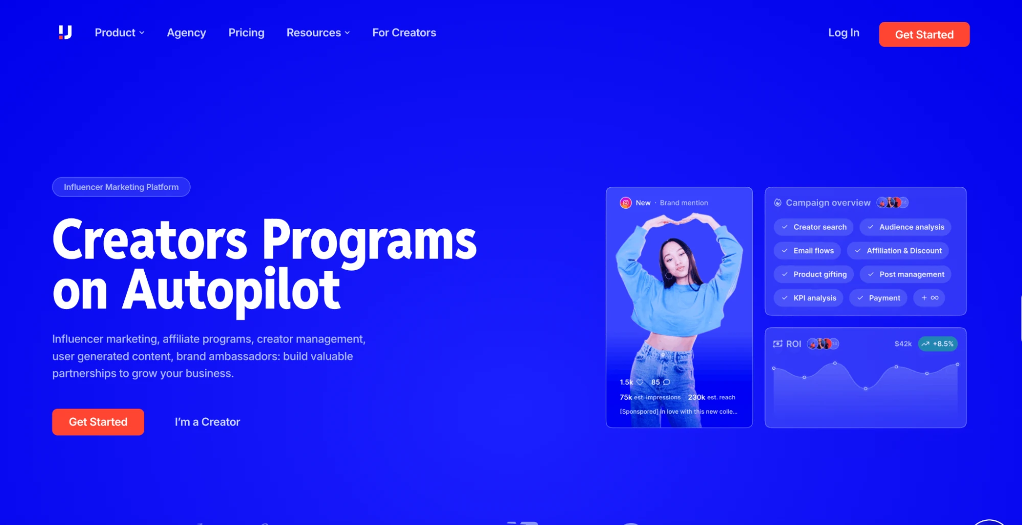
4. Upfluence
What is it? Upfluence is an influencer marketing platform that combines creator discovery, outreach, affiliate tracking, and international payments into a single tool, without the procurement process required by enterprise platforms.
Best for: Mid-market marketers or leaner ecommerce teams wanting discovery, outreach, and affiliate tracking without enterprise overhead.
Why I Picked It: The customer-matching feature is worth calling out. It scans your existing buyer database and surfaces customers who are already following your brand, which gives outreach a warmer starting point than cold creator lists. International creator payments in local currencies solve a logistical problem that often becomes a bottleneck in global programs.
Features
- Customer matching scans your existing buyer database and surfaces customers already following your brand, giving outreach a warmer starting point than a cold creator shortlist.
- Creator discovery, outreach, affiliate tracking, and international payments inside one platform, without the formal procurement process that enterprise tools demand.
- International creator payments in local currencies, removing the cross-border payment logistics that typically slow programs running across more than one region.
- Covers Instagram, TikTok, YouTube, X, and Twitch across its creator database.
Limitations
- LinkedIn creator coverage is thin compared to Upfluence's consumer-platform coverage, a gap that directly affects B2B programs where professional-audience creators are the primary target rather than a supplementary channel.
- Trial access is only granted after an initial consultation call with sales. There's no way to evaluate search quality or test the interface independently before entering a commitment conversation.
- The attribution and tracking logic is built primarily around consumer ecommerce cycles. B2B teams with longer sales cycles or enterprise buyer journeys will find the conversion tracking misaligned with how their campaigns actually work.
Pricing
Custom quoted and demo-gated, with a 12-month minimum contract. Upfluence completely avoids publishing standard rates or fixed numeric prices on its public website. The software uses a modular pricing model where businesses pay a fixed platform fee tailored to their chosen features and team size. No self-serve trial is listed on Upfluence's public site. Accessing the platform requires a consultation call first, so you can't evaluate search quality or test the interface before entering a sales conversation.
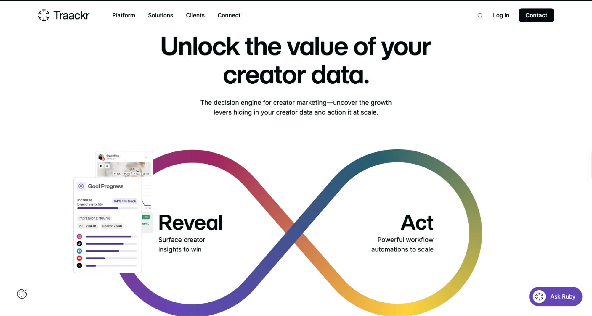
5. Traackr
What is it? Traackr is an enterprise influencer marketing and measurement platform built for global, multi-market brand programs, covering creator discovery, relationship management, campaign tracking, and brand-impact benchmarking against named competitors.
Best for: Agency Lead managing multiple client accounts with long-term relationship tracking and benchmark reporting.
Why I Picked It: Traackr's benchmarking is the reason enterprise teams pay for it. Being able to measure your program against a named competitor is genuinely hard to find elsewhere on this list. The database is smaller than most discovery-first tools here, and there's a real learning curve. Budget time for onboarding.
Features
- Brand-impact benchmarking against named competitors, so leadership sees where your program actually stands in the category rather than just how it performed against last quarter's internal targets.
- Cross-platform creator search with filtering by job title, location, language, platform, and engagement rate, built for teams vetting creators across multiple regional markets at once
- Long-term relationship tracking that compounds over time, making year-two creator cohort data substantially richer than anything you could reconstruct from a spreadsheet across the same period
- Coverage across 70+ countries and 26 languages for programs running in more than one region simultaneously
Limitations
- LinkedIn is treated as a secondary channel in Traackr's discovery layer, limiting depth for B2B programs where professional creators are the primary target rather than a supplementary one.
- Meaningful benchmarking insights only emerge after multiple campaign periods of data collection. Teams in their first quarter on the platform won't have the historical baseline to make the comparative layer work as designed.
- The platform is built for stable, always-on programs with long-term creator relationships. Teams that rotate their creator roster frequently or run short-burst campaign windows will get significantly less value from the relationship tracking logic.
Pricing
Traackr uses a custom-quoted pricing model tailored to specific organizational needs, so exact rates are not published on its official website. Every plan requires an annual contract commitment, as monthly billing is not available.
Pick the Platform When the Spreadsheet Stops Keeping Up
A dashboard is a live operating view. That distinction is worth holding onto when you're deciding what to set up next.
Start with a spreadsheet if your program is small and stable. It will cover what you need. Move to a dedicated platform when creator count grows past 10, when you're managing creators across three or more channels, or when stakeholders start asking ROI questions faster than you can export data. At that point, the spreadsheet isn't just inconvenient. It's producing numbers that are already wrong by the time they're in the room.
Favikon's 7-day free trial requires no credit card. Start there, run your current creator roster through it, and judge it against the numbers you're already tracking.
Frequently Asked Questions
What Is an Influencer Marketing Dashboard?
An influencer marketing dashboard gives you a live view of every creator and campaign across your connected social channels. It updates as campaigns run, not just at month-end. Reach, engagement, spend, and click activity all land in one place, so you're not rebuilding the same picture from multiple tabs each week.
What Is the Difference Between an Influencer Marketing Dashboard and an Influencer Report?
An influencer marketing dashboard is the live view you check regularly. A report is the finished document built from that data at a fixed point in time, for a specific audience. The dashboard feeds the report. Teams without one end up rebuilding the same numbers from scratch every reporting cycle.
What KPIs Should Be on an Influencer Marketing Dashboard?
An influencer marketing dashboard should track KPIs from five groups, reach, engagement, cost, ROI, and audience quality. Most teams only need 8 to 12 metrics they'll genuinely act on, not everything a platform can technically show. Cover all five groups, and you'll have enough context to make a real decision on a creator or campaign in minutes, not hours.
How Much Does an Influencer Marketing Dashboard Cost?
Influencer marketing dashboard costs range widely by program size. Self-serve tools with published pricing start around $199 to $500 per month, depending on creator volume and channel coverage. Mid-market platforms usually require a demo call before sharing rates. Enterprise tools are custom-quoted, with most implementations running above $2,000 per month based on third-party benchmarks.
Can I Build an Influencer Marketing Dashboard for Free?
Yes, you can build a basic influencer marketing dashboard for free using Google Sheets or Looker Studio templates. It works for small programs with fewer than 10 creators on one or two platforms. Past that threshold, the time it takes to keep it accurate starts to cost more than a paid tool would.
Do I Need a Separate Dashboard if My Platform Already Shows Analytics?
Yes, an influencer marketing dashboard is worth adding even if your platform shows analytics, as long as you manage creators on more than one channel. Native analytics only cover their own platform and won't unify Instagram, TikTok, and LinkedIn into a single view. A dashboard adds spend tracking and lets you calculate cost per engagement across your full program.
Which Influencer Marketing Dashboard Works Best for Fast-Moving Teams?
Favikon is the strongest influencer marketing dashboard for teams that don't have time to source and vet creators by hand. Its AI Agent handles shortlisting and reporting, and every profile carries an Authenticity Score by default. That combination saves the most time for teams running multiple campaigns across verticals at once.
Others articles